/ Preston Rowe Paterson
Preston Rowe Paterson
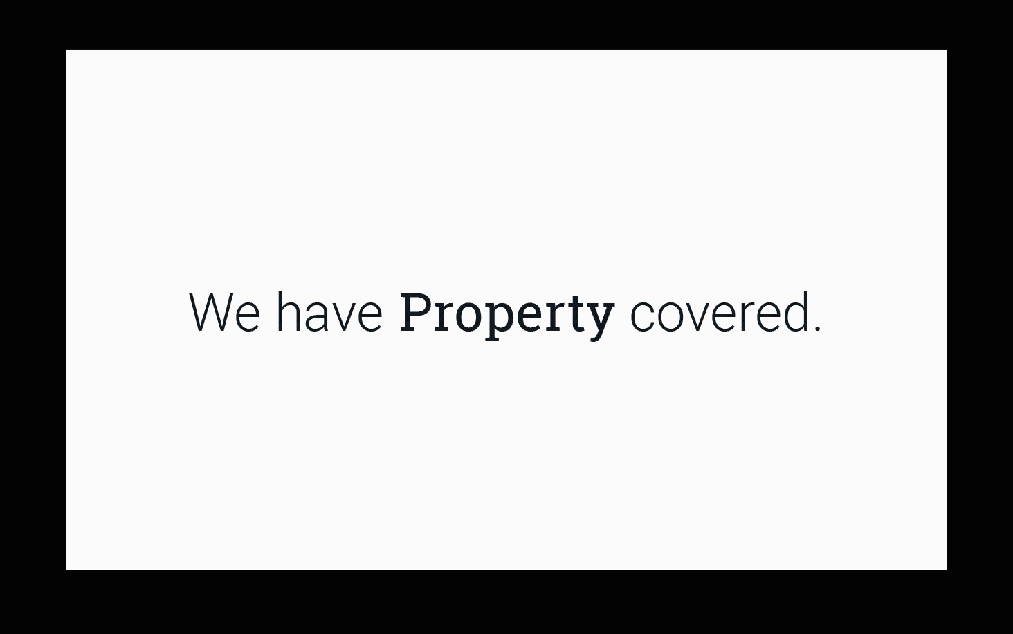
An international titan of property: building consistency with the right map.
Background
Preston Rowe Paterson have a property covered. A major international property consultancy firm with over 20 offices nationwide, additional locations in New Zealand, and plans to continue their impressive expansion; their philosophy is to be recognised as elite suppliers of property investment and development.
The Challenge
With a wide reach in a scattering of locations, offices and disciplines; Preston Rowe Paterson needed a way to unite their marketing efforts under one PRP banner. A logo and some website design may have been a good start: But they really needed a fundamental communication strategy, and that’s precisely what we were able to offer.
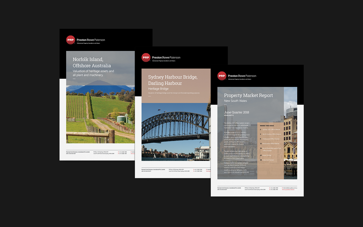
Deliverables
- Rebrand
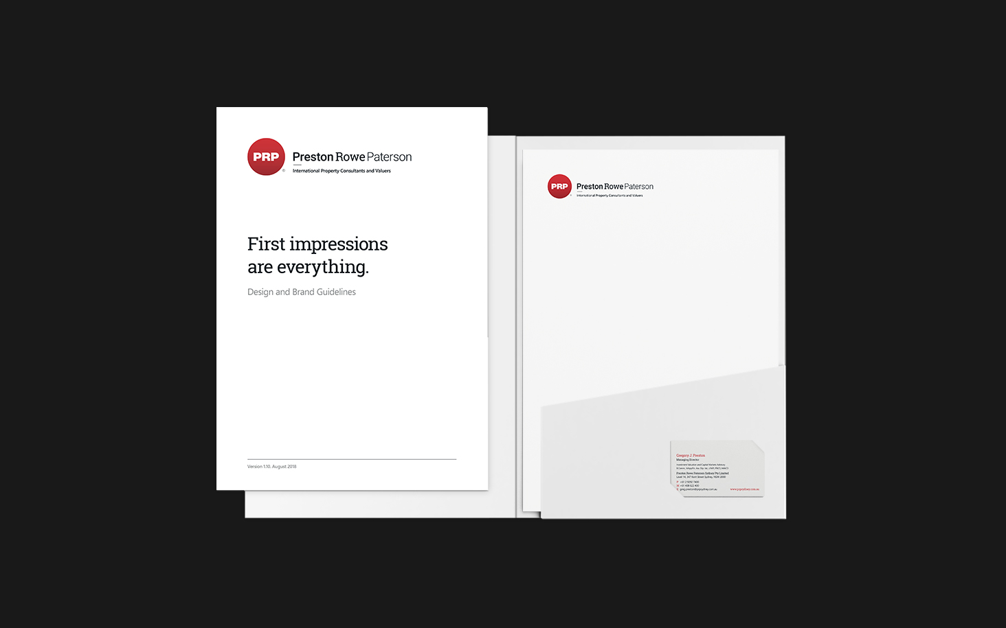
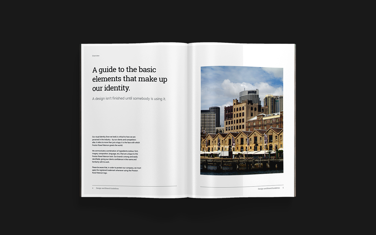
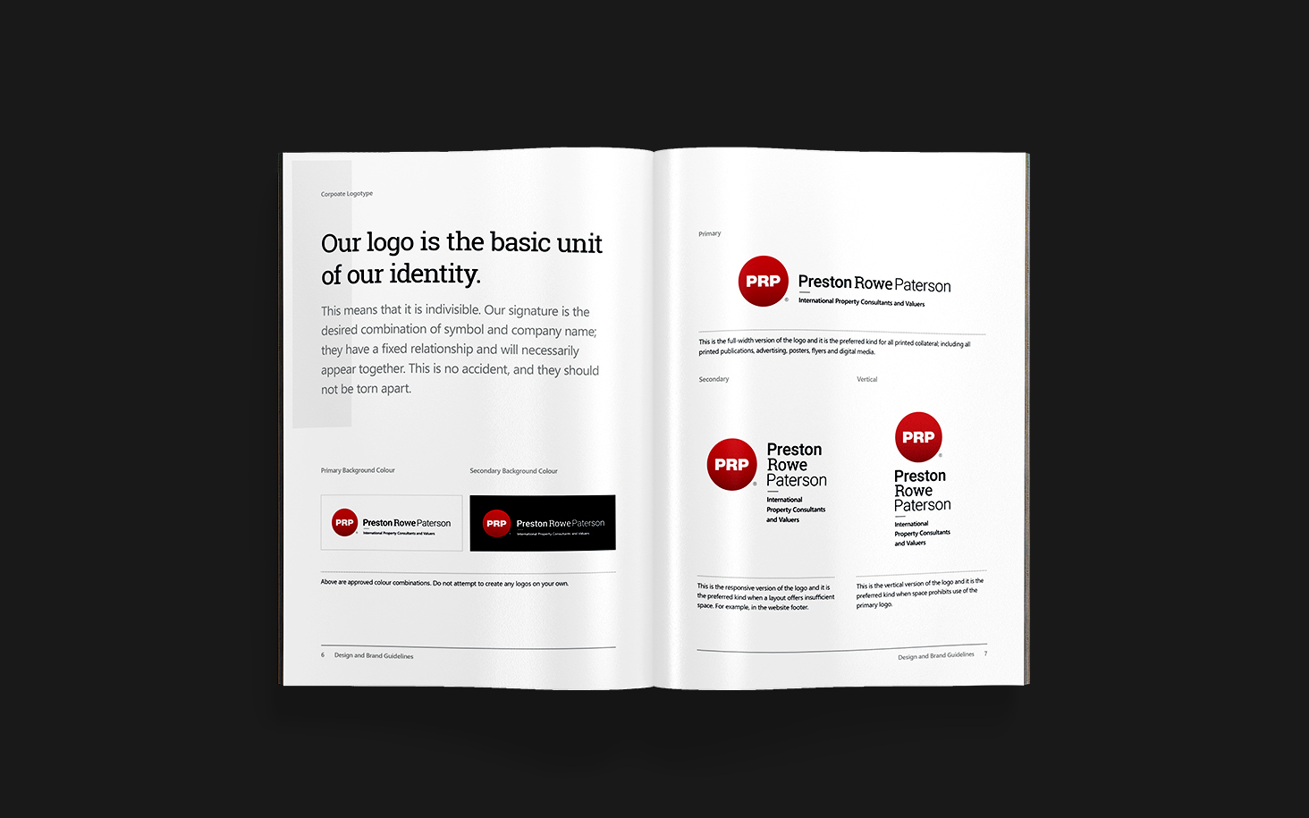
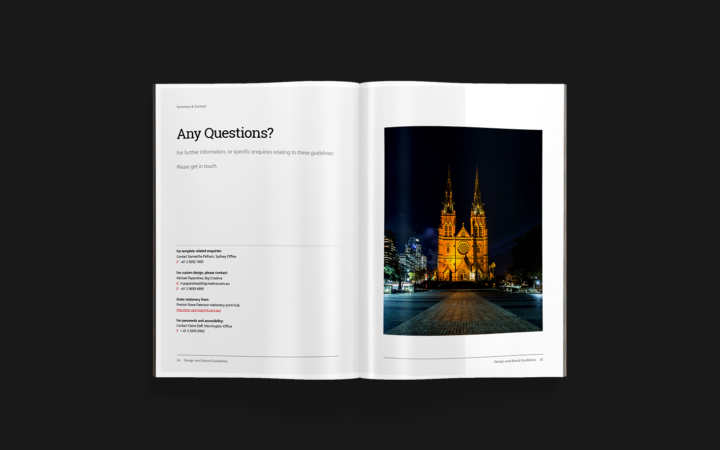
- Brand Style Guide
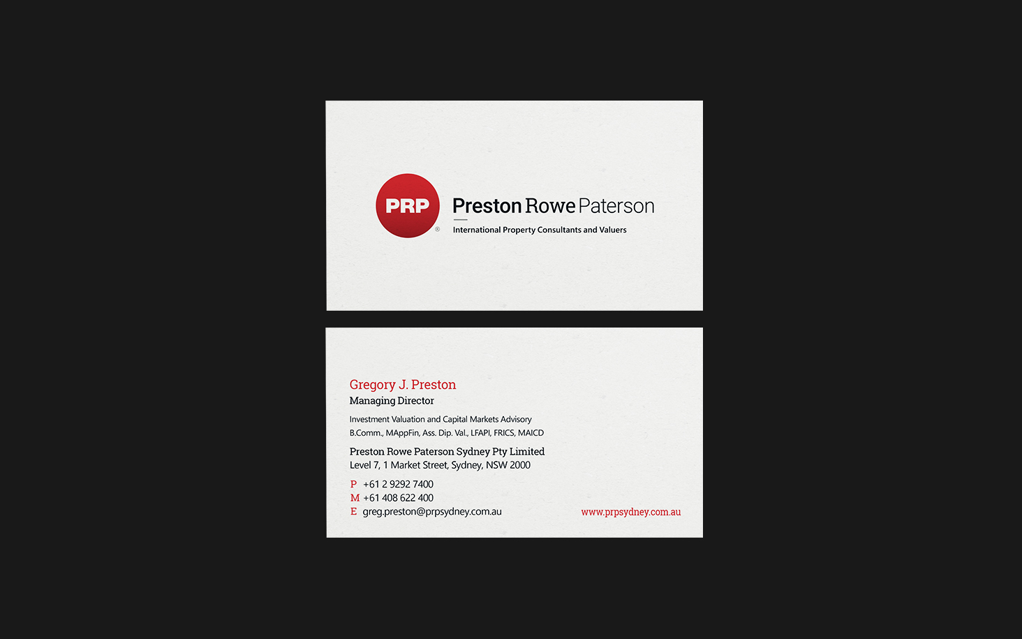
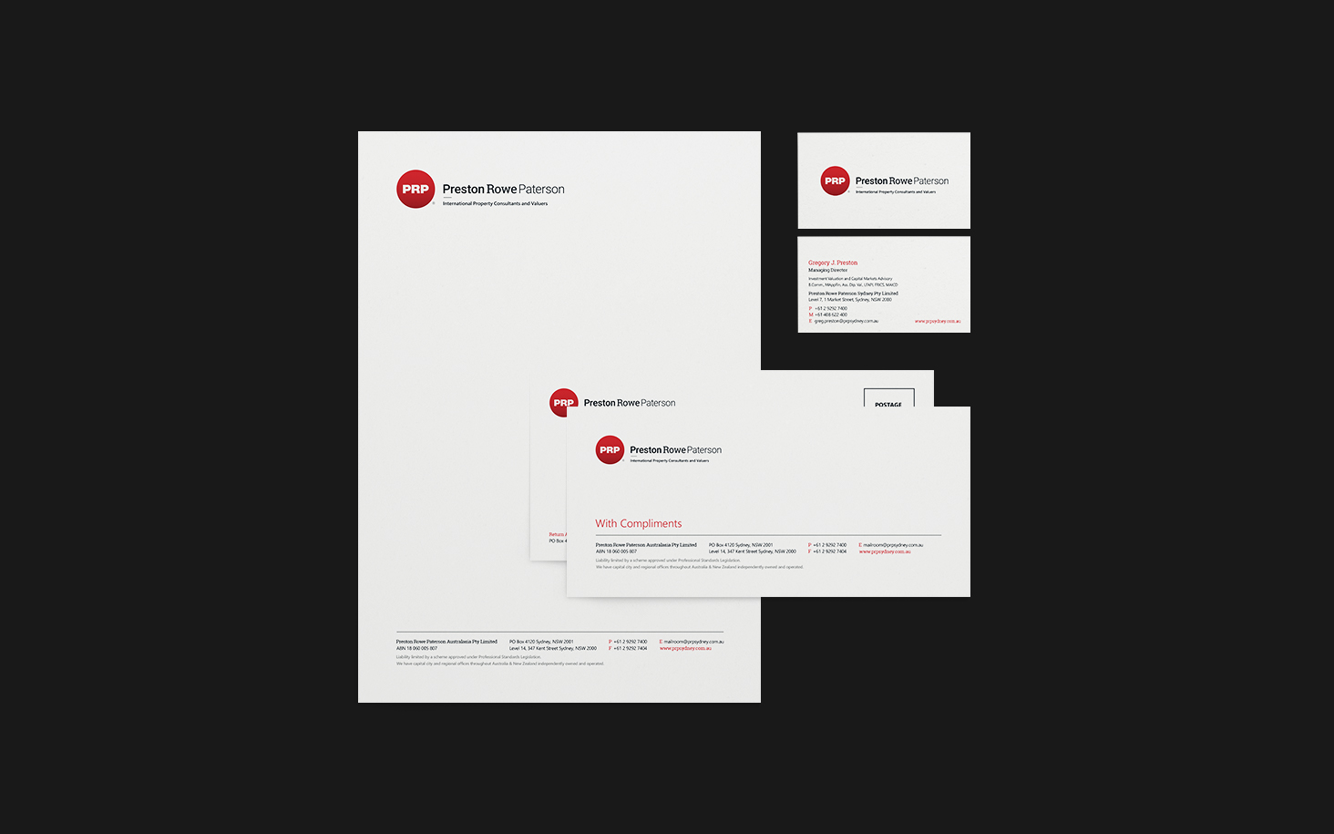
- Stationery
- Company Documents Graphic Design
- Reports Graphic Design & Template Creation
- Social Media Branding
- Email Marketing
- Marketing Collateral
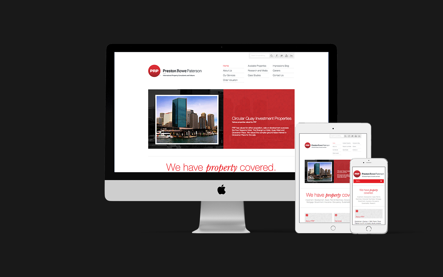
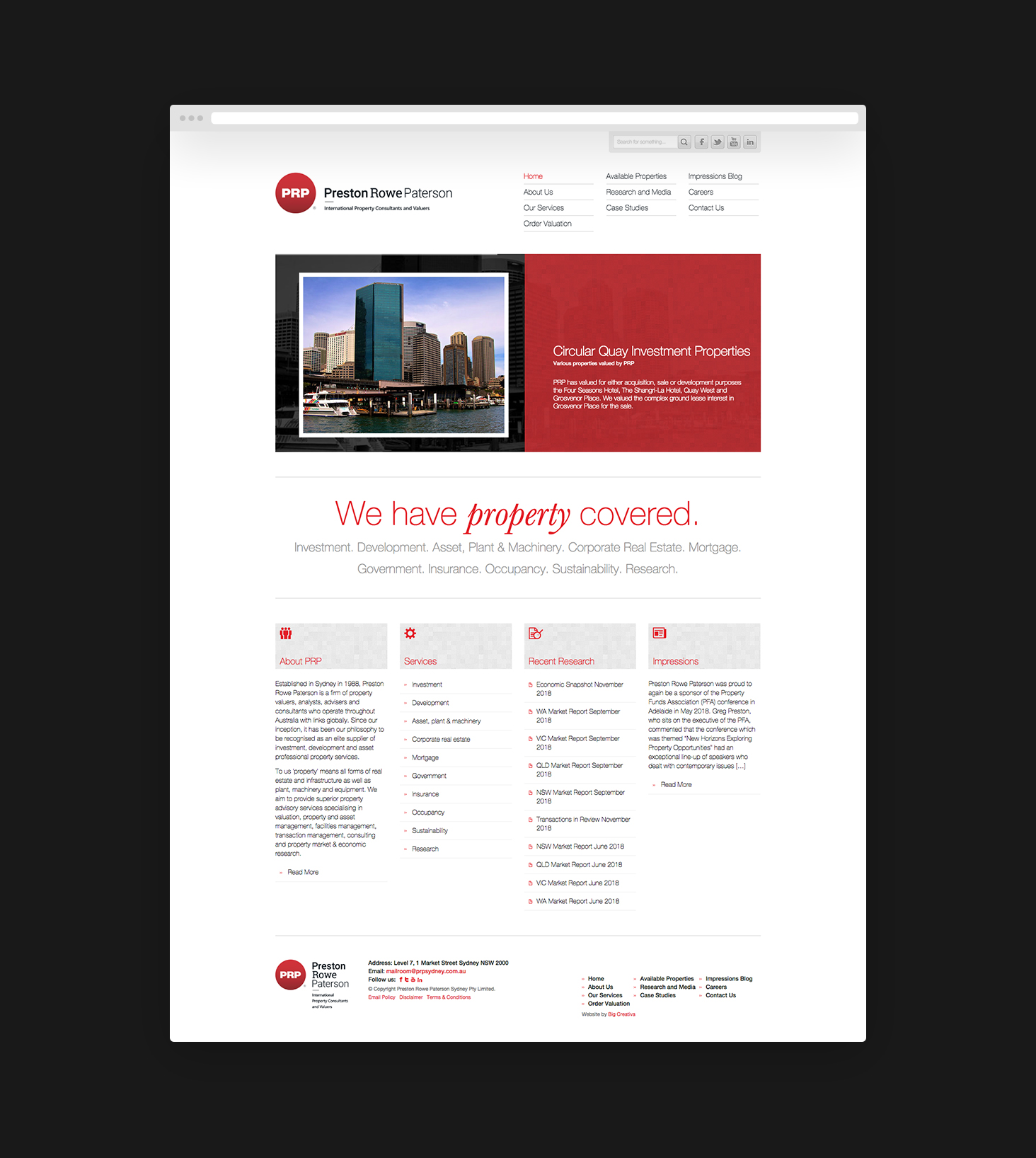
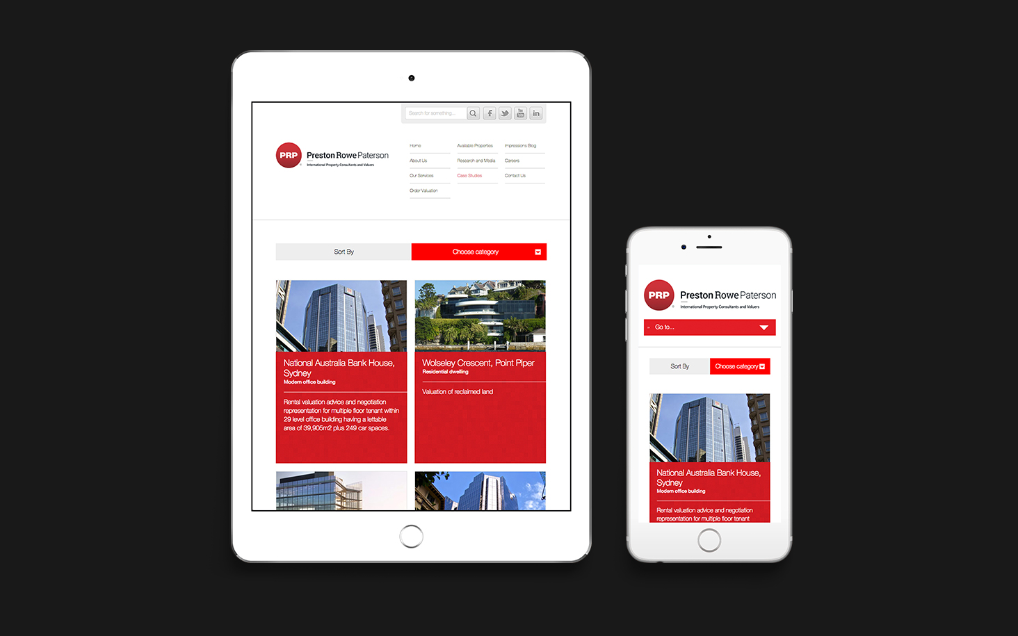
- Custom Website
- Photography
- Art-Direction
Outcomes
People are quick to confuse strategy with the tactics implemented. For a Big voice in the market such as Preston Rowe Paterson, it’s important that all pieces are moving in the same direction. This is where our acutely designed Brand Style Guide and Guidelines served as a strategic map, rather than just a brochure of nice-looking colours. The goal was to give PRP a sense of consistency in all of its communications and customer experiences. Tactics for each website, marketing collateral, photography, social media branding and company document graphic design were all able to flow naturally once we knew that we had captured the PRP story and brand at its essence. This also meant introducing and launching a new slogan, which has allowed Preston Rowe Paterson to present itself to new markets (and existing) as a modern, clean and professional titan of property.
Launch Website